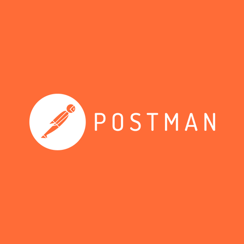
Postman
Postman is the ONLY complete API Development Environment made for developers by developers. As the lead designer working with Postman's marketing team, I am responsible for all representations of the Postman brand. Projects include a refresh of the Postman logo, website, e-mail design, digital ads, and illustrations.
Before > After
Developers use Postman to make calls to the APIs they’re working with, connecting their apps with other platforms all within the Postman space. The Postman branding had been established before I joined the company. In it's original form, the previous logo was created to represent our product and company as being approachable, straight-forward, and simple. With these principles in mind, the original logo was styled in a minimalistic, geometrical interpretation of a spaceman, coined as the Postmanaut. The original mark, while strong, gradually became a bit cumbersome as the company evolved. As Postman gained more and more popularity, the company quickly grew to be more than just a tool to send and test API requests. Our app had leveled-up and become a complete API development environment, or ADE, that touched on every point of the API lifecycle. With this shift in the product, we became aware that our brand needed to be more universal and directly reflect how Postman unifies all stages of the API lifecycle.
Unify (verb): make or become united, uniform, or whole.
I wanted to keep the definition at the forefront of my thinking as I began to ideate on how to best represent the Postman brand within it's new place as being an all-in-one solution for API developers. Looking at the original mark I could see how there were slight breaks in it's unification. The feet stuck out, and while asymmetry isn't bad, it felt as if the Postmanaut was a bit off balance. The entire mark itself felt busy as well. With the Postmanaut being multi-colored it started to feel as if it was it's own separate piece instead of the mark being strong as one unit. The logo needed to be more connected and to feel strong individually as a mark and with the logotype.
Initial sketches
A few first options
"HOW CAN I BRING EVERYTHING TOGETHER?"
I began to play with how to represent bringing everything together without losing the brand's original intent. On top of that, I wanted to give the mark a bit of a touch up and take away some of the sharpness as well as insert a bit more of a humanized touch. The issue with our color usage was problematic as well. After playing around with trying to use all four of the colors it became obvious that having four colors in our brand was going to create more challenges in the future. Not only for creative use but also in terms of growth, if the brand continued to use all of the colors, over time having the four separate colors would be more costly as well as more difficult to work with in grayscale. To decrease this cost and reduce the busy-ness of the color palette, I chose to cut down the color usage to only using Postman’s main brand color. With this solution, having only one color cut down on costs and also gave the cleanest and most versatile option.
Next came putting it all together . I chose to bring the Postmanaut into the center of the circle, bringing focus on the entire logo as a unit rather than separated pieces (spaceman + circle). Rounding off some of the harder edges gave the Postmanaut more of a human touch. By creating some shape to his body rather than being a small sliver the Postmanaut was easier to recognize as a spaceman rather than, say, a fountain pen. With the refresh, the Postmanaut is fully contained in order to fit in various mediums as the brand continues to grow.
Learnings
I’m proud of the result that came out of this banding exercise. Refreshing the Postman logo was more of a challenge than I had imagined.
I learned more about logo accessibility. The Postman logo needed to be used in all sizes but it contained lots of little details. In larger formats, all of the details are perfectly recognizable. But shrinking down to smaller formats for use such as favicon and banner ads proved to be trickier in order to keep everything legible.
The most important thing I learned though, was that of working with a brand that people already knew and loved, but how to ease them into a new look. Having constraints to my design was both a curse and a blessing. Because Postman is already recognizable everywhere in the developer community I had to be cognizant of not changing the mark drastically. But on the flip side, I didn’t have to start from scratch. There was already a great concept, and I was given the opportunity to make it better.


