Fuel: Eat clean, live well
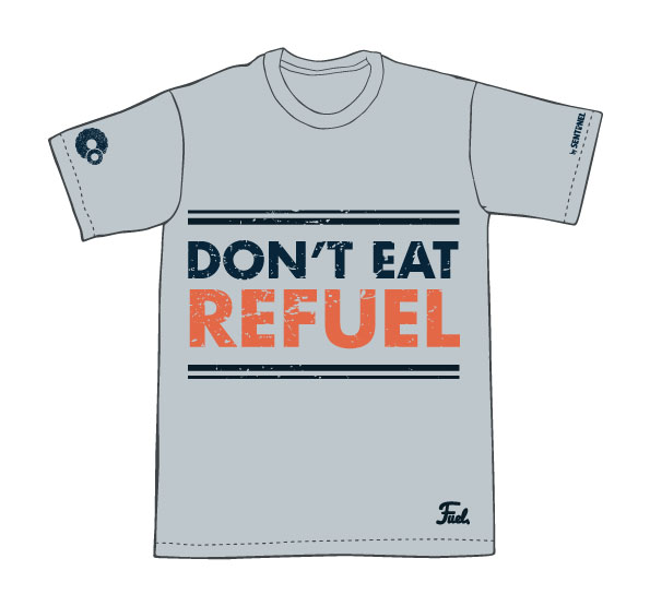
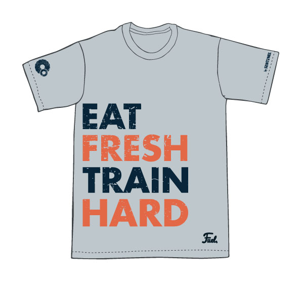
Sentinel Crossfit in Seoul, South Korea came to me to help build their brand for a new chain of food stalls focusing on clean eating and nutrition. They wanted Fuel to showcase not only a focus on replenishing nutrients to the body but also a fun and inviting feel for people of all fitness levels to enjoy the brand and it's menu items.
BRANDING CONCEPT
Inspired by vintage signage, the Fuel identity was born. The muted blue-green tones are accented by a pop of warm orange tones to represent the idea of igniting our energy sources within our body.


